Wednesday 13 February 2013

Group Advert Analysis

Harry's Advert


Advert 1
Advert 2


Harry's first advert is my favourite out of the two as it is straight to the point, simple and includes an image of the artist at the top to catch the audience's attention. Although Harry hasn't altered the image of the artist in any way, it looks really good sat at the top of the page with the all white background. The grey text isn't too stark against the white and the information is all perfect.

Advert 2 is less creative however still includes all of the essential information. The black and white stripe is effective however possibly less so for this genre.


Ryan's Magazine Advert

Advert 1
Advert 2


Ryan's magazine advert 1 is effective and simple. Having the whole imagery black and white of the instrument and then having the artists face at the front left is powerful and effective showing the importance of the artist. The red writing although a bright is effective as it would catch the audience's attention when flicking through a magazine and seeing this. The content is to the point and short with every bit of information needed except when the CD is out but it doesn't have an image of the CD cover.

However advert 2 is much better and shows a greater use of Photoshop. The background being black and white is effective and basic and not in the audience's face too much. The image used of the artist is natural and forms to the conventions of the music genre. The text is the same of which features in the album cover shown in the bottom right corner of the advert linking the two ancillary products.  The outer glow used on the text is vital to make the writing stand out from the black and white background.


Adam's Advert

Advert 2
Advert 1


The first advert sticks to a patriotic theme of being British with the red white and blue in the top right corner. By having this image of the artist right in the middle of the advert it makes the audience focus solely on his face and. I like the simplicity of the advert however to improve it I would of possibly used the same font for all words and made the name of the artist bigger.

The second advert is my favourite out of the two due to having the album cover in the bottom right corner but also the image of the instrument in the middle. It brings in conventions of the artist showing the importance of the instrument. The only thing that could possibly be improved is if there was more information on the adverts to promote the artist further.

Final Digipak

After looking through all of our digipak's as a group, we decided that the best person's to use was Harry's. This is because there is a consistent theme of the instrument used by artists of this genre throughout the digipak. The cover shows simply the artist in a natural environment and uses a plain white background. Although we used Harry's digipak we decided as a group to use Adam's double page of London to be part of our final digipak as we all liked this idea and having an image of London, where the music video was set, to be in the digipak showing the audience more about the artist, leading to connotations of where he lives. Each slide has various effects used on Photoshop like fade, the use of brightness dark and light and the use of the magnetic lassoo tool.


Group Digipak Analysis


 Harry's Digipak

In his digipak, Harry has used an image of a guitar throughout except on the cover of the album. This is effective as it sticks to a theme and concentrates on not materialistic things, but more natural and sticking to the music. It gives the digipak a more simplistic feel. My favourite part of the digipak is the thank you page on the bottom left. I like this because the artist's face is visible at the bottom but faded out.


Ryan's Digipak

Ryan's digipak is also simple and to the point. Ryan's digipak although basic is effective and has stuck to a black background theme. This album could be improved with more images of the artist and possibly by using the same font throughout the whole digipak just to keep it continuous and flowing. Although I admire the simplicity of the album, it doesn't necessarily form to conventions of the Alternative Pop genre. 


Adam's Digipak

Adam's digipak conforms to conventions of the Alternative Pop genre due to the use of colours and instruments. I like the image he has used for the artist on his front cover of the digipak however I do think that that blue, red and white colours could be changed to softer colours or greens to show nature. I think his disk could be a little more creative with possibly an image of an instrument or the artist himself. However the last image at the bottom of London is a double page. I like this idea and the idea of having an image of where the music video takes place.


Digipak Reflection


The digipak above is the one I created on Photoshop using images I had taken myself. Some images were taken from the footage and others from a photoshoot. I used an outer glow on the title of the album which is the artist name. I decided to use the name of the artist for the album title as it is simple and effective and directly to the point. I made the words spread out off the page to give it a different feel and make it the artist' 'thing'. I did this on all of my ancillary products to set this artist apart from the others.


For the cover of my digipak I took a picture from one taken from the photoshoot of the artist. I chose this shot because it looks natural, a convention to the genre that my I was trying to portray. I added an outer glow to the artist to make him stand out a little more from the background and did this also to the title of the album 'Justin Oakley' to make it stand out a little more. By using a natural shot it builds a better relationship with the audience as they won't see the artist's image as being fake, referring to Dyers Star Theory.


The image for this slide was taken from footage that had been taken in Hyde Park. On Photoshop I took the artist from the background using the magnetic lassoo tool and left the background a stark white allowing the artist to stand out. Once increasing the size of the artist himself, the image looked pixelated so I decided to add a cartoon effect. 


I needed an inside image of the artist but like the cover of the digipak I decided to keep it natural with wildlife like the cover of this ancillary product. I inserted the image on Photoshop and added a blur effect just to make it more interesting to look at.


For the disk I decided to use one of the most natural shots I could find of the artist. Using photoshop I was able to not only apply blur but also make the background of the tree's black and white, making the artist stand out. I faded out the colour of the artist's face making him look more angelic and then applied an outer glow around his head sticking with the theme of the cover. For the writing I just put the title of the album 'Oakley' in the same font used before and applied the outer glow too, to stick with the theme created and the to stand out from the black and white background.


This slide is the thank you page from the artist to the fans. I used an image of a cello that I had taken and changed the brightness to make it fade a little so the white writing in the middle would stand out. By using this image of the instrument, it conforms to conventions of the genre, staying simplistic and focusing on the music. The writing is short, sweet and directly to the point, not to complicate the simplicity.


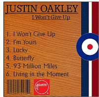
For the back cover of my digipak I took an image from the photo shoot, and have used a plain background of just nature/wildlife. I increased the brightness of the image and added black and white and then increased the brightness again. I used the same font that is used throughout the digipak for the song names and put them in the middle of the slide. I then added an outer glow just to make it stand out a little more from the background and also just to flow with the rest of the digipak.