

Harry's Digipak
In his digipak, Harry has used an image of a guitar throughout except on the cover of the album. This is effective as it sticks to a theme and concentrates on not materialistic things, but more natural and sticking to the music. It gives the digipak a more simplistic feel. My favourite part of the digipak is the thank you page on the bottom left. I like this because the artist's face is visible at the bottom but faded out.


Ryan's Digipak
Ryan's digipak is also simple and to the point. Ryan's digipak although basic is effective and has stuck to a black background theme. This album could be improved with more images of the artist and possibly by using the same font throughout the whole digipak just to keep it continuous and flowing. Although I admire the simplicity of the album, it doesn't necessarily form to conventions of the Alternative Pop genre.


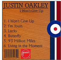
Adam's Digipak
Adam's digipak conforms to conventions of the Alternative Pop genre due to the use of colours and instruments. I like the image he has used for the artist on his front cover of the digipak however I do think that that blue, red and white colours could be changed to softer colours or greens to show nature. I think his disk could be a little more creative with possibly an image of an instrument or the artist himself. However the last image at the bottom of London is a double page. I like this idea and the idea of having an image of where the music video takes place.


This post shows some group discussions and this is evident through your analysis above, which shows that you and your group have considered the various designs. You now need to explain which digipak you and your group will submit and why?
ReplyDelete